
You have to feel for Asao Tokolo. In April 2016, the Emblems Selection Committee of the Tokyo Olympic and Paralympic Games announced that the little-known artist had won an open competition to design a logo for the 2020 Olympiad. The original logo, designed by Kenjirō Sano, had been accused of plagiarizing the logo of Belgium’s Théâtre de Liège. (Sano had said that he had never even seen the theatre’s logo but as accusations grew, the committee ordered the competition run again.)
The new design, which carried a prize of a million Yen ($9,362) and tickets to the opening ceremonies of both the Summer Olympics and the Paralympics, took the form of an indigo-colored checkerboard ring above the words “Tokyo 2020” and the Olympic rings. In March this year, the games were postponed until 2021. Tokolo’s logo, with its “refined sophistication of the Japanese tradition”—and the wrong year—will remain unchanged.
The world might have stopped in 2020 but branding continues. Businesses still want their identities to stand out. They still want to be remembered and they want to capture in a single image what they do and how they do it. They also need to show that they’re modern and up to date, which means regularly refreshing their look to keep up with current design trends.
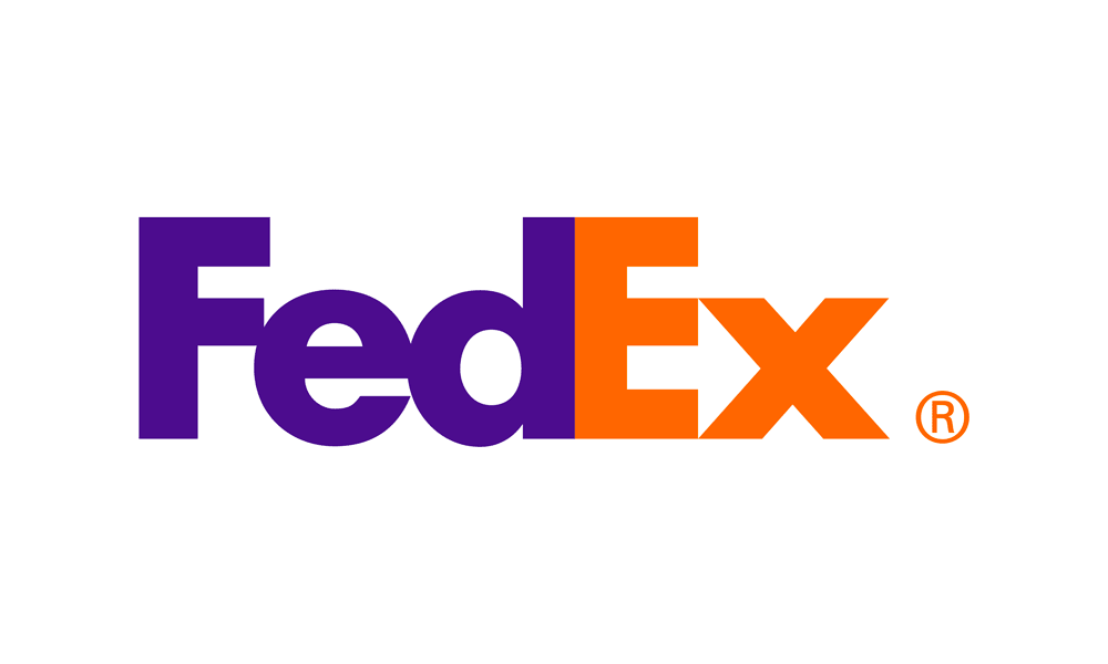
Each year, Bill Gardner, president of Gardner Design and the founder of LogoLounge.com, releases a report covering the previous year’s trends in logo design. A number of design styles stand out. Counters that use negative space to hide a shape—such as the arrow in Federal Express’s logo—remain popular, as do mazes which, the report notes, continue “the monoline aesthetic with an even distribution of positive and negative weight.” “Sisters” that balance two harmonious elements, like truckmaker Oshkosh’s logo, are still popular with designers, as are the bevel tips used by Duolingo and environmental companies. Gothic-style blackletter is still in, helped, no doubt by the rise of micro-breweries keen to associate themselves with the land of pilsner and bierfests. Chexmelt, with its checkerboard patterns suggestive of connectedness, like Samsung’s logo for its Exynos processor, turns up frequently and appears to have influenced Asao Tokolo’s Olympic design.
Some of these trends are continuations of styles that have long been popular. FedEx’s counter has been around for more than twenty years. Blackletter, the report notes, was Europe’s only font for five hundred years. But some of the most popular trends are a direct result of changes in technology, in particular, the move from a CMYK to an RGB environment. The world of logo design had had a pretty strict set of rules for generations, explains Bill Gardner. Logos had to be simple with just one or two colors at the most, and absolutely no gradients. Limitations in scaling and reproduction meant that logo designers had to work within tight confines.
“The introduction of an RGB digital environment removed the blinders we’d been traveling with,” says Gardner. “Suddenly the environment clients lived in allowed for infinite variables to a visual brand. Logos could animate or scale without loss of detail or they could embrace gradient tones because designers weren’t as concerned about print reproduction.”
As digital publication has freed designers from the limits of color and scale, so the tools they use to create their designs have also become more sophisticated, creating new possibilities, new influences, and new trends.
“A new app, plug-in, or capability on a digital device is like any new gift,” says Gardner. “It becomes a thing of infatuation to be explored. It opens a door of adjacent possibilities that was shut until that time, and as an inquisitive sort we investigate.”
This year, for example, has seen a strong trend towards variable fonts that give designers the ability to scale weights as they wish, and vary width, slant, optical sizing, serif shape, and even italics in the same font file.
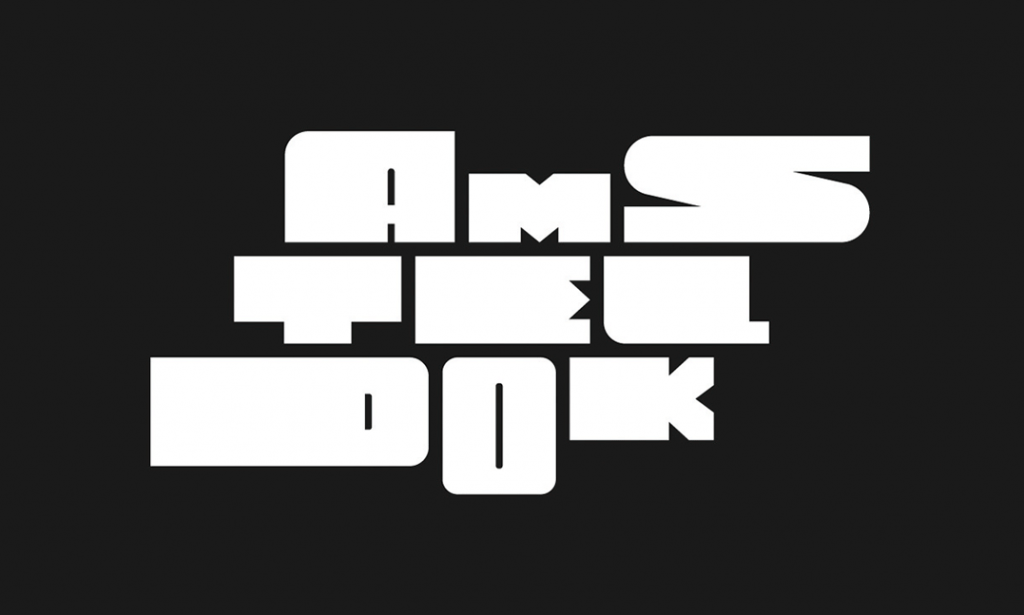
One result is the logo for Amsteldok, WPP’s new Amsterdam campus. A video promoting the site shows the letters growing and shrinking, while the logo itself uses stretched fonts in different sizes and weights to suggest a multiplicity of creative ideas and directions. Amsteldok, the variable font logo appears to suggest, doesn’t just produce one style or one concept. It has creativity for every business.
Variable fonts give the same sense of movement to Barcelona’s Design Week, while the logo that design firm Ueno made for marketing company Essence uses dynamic fonts to thin letters from left to right, and suggest that the company helps “clients get to the simplest, most efficient—and most effective—articulation of an idea.”

However, the inspiration for this use of different weights in the same logo didn’t come from the potential that designers found in variable fonts. It came from the animations that programs used to demonstrate them. Those demonstrations demonstrated how the typeface could expand and deflate at the designer’s will.
“Instead of selecting a single weight and putting it to use,” says Gardner, “designers wanted to use these fonts in full animation as they went through their contortions.”
The result has been an attempt to replicate in logos the fluidity, movement, and variety that the designers saw in the animations promoting the fonts themselves.
The availability of fonts that can be endlessly changed and adapted, then mashed together in different weights, isn’t the only technological innovation that’s pushed design creativity lately—and beyond its limits. Plug-ins also allow designers to animate a word so that it appears to be circling in perpetual motion, like Foot Locker’s House of Hoops logo, designed by SouthSouthWest. The loop, says the company, “was inspired by stadium Jumbotrons and digital displays, synonymous with the big stage, and the big moments.” The hoop itself is intended to speak directly to the fan experience of the game: “always on and forever changing.”
The inspiration for this kind of kinetic rotation came from Adobe AfterEffects CC. According to Bill Gardner, last year saw the production of several dozen logos whose entire design aesthetic was a “lamely rotating” name of an organization or conference.
“Ultimately any new tool is used in a pretty nascent way until our exploration of it allows us to use it in a more mature application,” says Gardner. “Nothing new here but that designers love new tools.”
So if you’re commissioning a logo this year, don’t be too surprised if your designer feels inspired by their tools and produces a typeface of varying weights or tries to loop your logo because Adobe AfterEffects CC allows them to do so.
Branding, Not Blanding
That looping effect might suit a logo for basketball products but it won’t suit every brand, and it can produce what brand designer and strategist Jacob Cass has dismissed as “blanding,” a bland form of branding performed for the sake of modernity and UX patterns, but which comes at the expense of authenticity and differentiation. Brands, Cass argues, are looking for belonging and authentic connection: “standing for something, and not just for the sake of it.”
Bill Gardner tries to avoid reporting trends that he doesn’t like but he does identify trends that he believes are “wearing thin.” Designers, he says, have crafted fictitious logos filled with snakes, octopuses, fire, and three-eyed creatures to demonstrate enlightenment “and enough tigers to craft a sequel to Tiger King.”
This year’s trends have also seen the excessive use of gradients and the overuse of visual effects that add crystal caps, shadows, and shade in an attempt to lift brand marks off the page.
“These are too literal in their message in a field where concept is really the goal or aspiration,” says Gardner. “Every year we see a plethora of some element, like this year’s use of lightning bolts or four pointed twinkling stars. Next year it will be something else.”
A Logo in a Pandemic
The branding industry usually starts work a year ahead of release for large projects which means that next year’s logos and corporate re-brandings will have been produced by designers working from home and crafting designs that are then discussed in endless meetings held on Zoom. The influence of the psychological effect of lockdowns and quarantines on designers, consumers, and brands, and of the changes to the logo design process aren’t yet clear but there’s a good chance that they won’t be positive.
At the start of the pandemic, video advertising quickly adopted clichés that were repeated from brand to brand. Companies as different as Apple, Fedex, Mazda, and Chick-Fil-A were all keen to tell us that these were “unprecedented times,” which placed “placed distance between us” but which we would all get through “together.”
Those ads were produced quickly, with relatively small budgets, often by editing B-roll and without the need for new filming. Bill Gardner warns that similar circumstances may have similar effects on branding. “Crises tend to accelerate trends and cause us to skip steps that might naturally occur in development,” he says. “That means we occasionally run with an untested solution that might have failed on a traditional evolutionary timeline. We’ll see that with branding as well and that may mean more failures than usual.”
On the other hand, he suggests, the successes may be more bold and will have a more dramatic influence on other designers’ work in the future.
One trend to look for will be designs that demonstrate an organization’s ability to be responsive or flexible to consumer needs. In “uncertain times,” customers will need to know that service providers will be compassionate if a new outbreak forces a cancellation or changes what their own customers need. The absence of human touch over the last half-year could also see companies testing “humanistic design” that emphasizes the warmth in a brand relationship. This year’s trends report included a “beautiful array of hands,” usually facing upwards and with a product or symbol floating magically above the palm. It’s possible that next year, we’ll see more of those hands joined with other hands, bringing back at least a sense of the human touch that has been absent in 2020.
So what should a business owner thinking of re-branding expect now, and what should they bear in mind? Bill Gardner warns that anything coming out now will be reflexive and may not last but he also notes that well-financed companies are using this time to beat the competition, while entrepreneurial-minded workers who have been released from their jobs are bringing innovation to stagnant sectors or creating new sectors entirely. This is a great time, he says, to shake things up, and businesses that wait may find that they’re left behind by competitors using this strange time to get ahead.
Jacob Cass recommends that businesses think bigger, and remember that logos are only one tiny part of a business—and one element in a brand. “Have a purpose,” he recommends. “Create something that solves bigger problems.”
And maybe leave the year out of the logo.
Recent Comments